E-commerce · Live
Weider Bulgaria
A supplement store people can finally use on their phones.
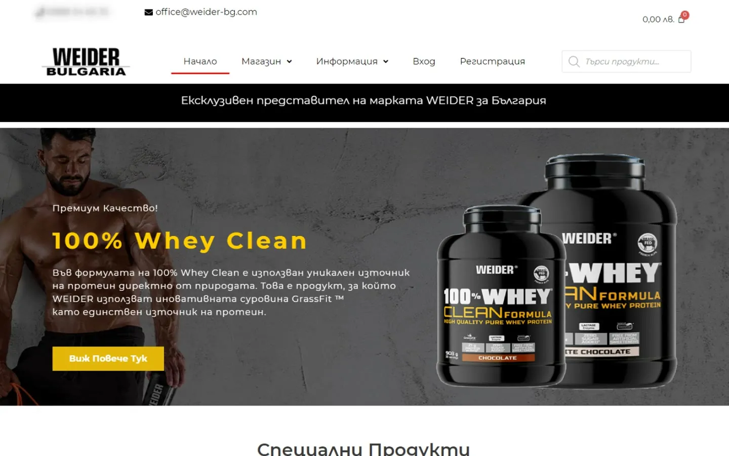
After I started to seriously study UX and UI design, it was only natural to use the new knowledge in the company I worked for. So in 2021 I redesigned and rebuilt the online store of the Bulgarian Weider distributor.
Problem
The old store ran on PrestaShop and was never designed for phones.
On a phone it simply shrank. The logo and the cart took up the first screen, and the offers were big images with the text baked in. With each passing year more people shop online, and it's unforgivable for a merchant to be without a quality website.
- Pain pointBuilt for desktop
The PrestaShop store shrank on small screens instead of adapting to them.
- Pain pointText inside images
Promotions and categories were banners with the words baked in.
- Pain pointProducts far down
On a phone you scrolled past the header, cart and banners before you saw a single product.
Research
I had two sources: the people who already bought from us, and the competition.
- Method 01Customer data
With the company's manager we weighed several directions, based on the data we had collected from long-term customers.
- Method 02Years in sales
My years in sales at the company told me which questions customers ask before they buy.
- Method 03Competitive research
Two names stand out in the Bulgarian supplement market. I won't share who they are, because they definitely don't need more advertising.
- InsightQuality and transparency
The competitors' weak spot is too many products of unclear origin, which confuses customers. Our customers know who we are and want the best, so that became the strongest message of the new store.
Process
Simple, easy to read, and consistent with every Weider partner around the world.
- Montserrat
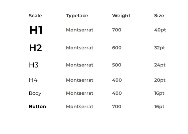
Probably one of every designer's favorite fonts: modern, beautiful and easy to read on any screen.
- Brand colors
- Black#000000
- Off white#F9F9F9
- Weider red#FF0000
Strictly in line with the brand and tied to all Weider partners, so the store stays consistent with distributors around the world.
- BuildWordPress and Elementor
I designed and built the store myself.
- BuildFully responsive
One store that works on mobile and desktop.
- BuildFour main parts
A home page with the shop, company information, and a contact page.
Solution
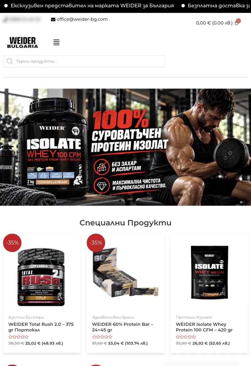
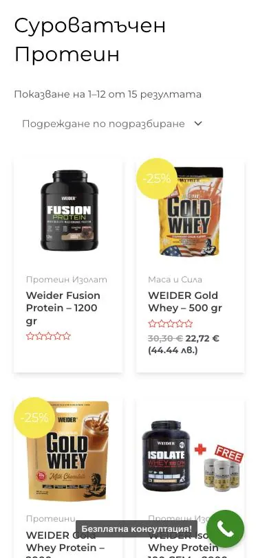
Same brand, same products. A store that finally works on every screen.
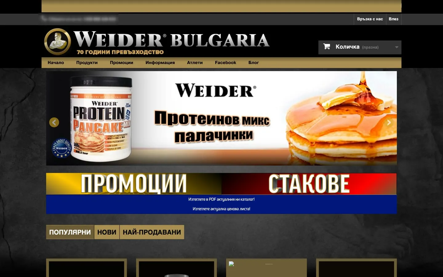
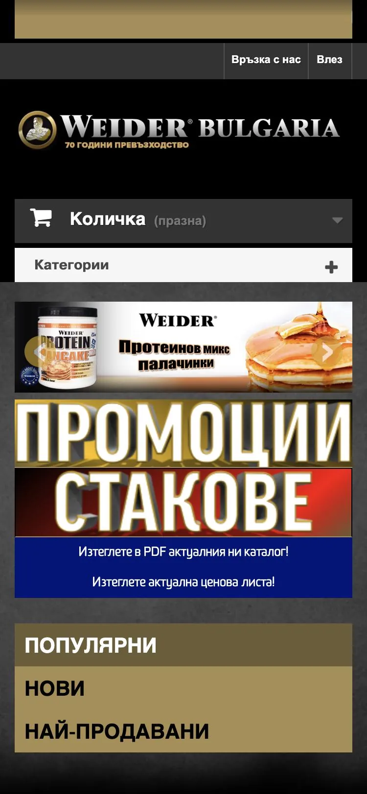
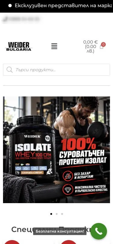
The same home page on a phone. The phone number is blurred.
Results
The new store brought more visitors, and online sales grew.
- +60%online sales after the new store went liveWeider Bulgaria
- TrafficMore visitors
The new store brought more visitors than the old one.
- Still live
The store is still running, so you can browse it yourself.
Visit the live store ↗