Fintech · Live product · NDA concept
OneBank
Bank onboarding that feels effortless, supportive and human.
The goal was to streamline registration in a mobile banking app, make every step clearer, and optimize the key interactions to improve the experience and the completion rate.
The real product is live. This case study shows a concept with mockup data, not the production system.
Problem
What should be a welcoming entry into digital banking became a source of friction and distrust.
As digital banking becomes the standard in Bulgaria, people expect fast, transparent and intuitive onboarding. Research and user feedback from three leading Bulgarian banks showed a big gap between those expectations and reality. Poor communication and limited support made every problem worse.
- Pain pointIdentity checks fail
And nobody tells you what to do next.
- Pain pointA new phone locks you out
Switching devices is a dead end.
- Pain pointWallets don't connect
Google Pay setup breaks without a clear reason.
- Pain pointNo sense of progress
Even tech savvy customers can't tell how much is left.
Research
I compared the onboarding of three leading Bulgarian banks feature by feature, then read what their customers wrote about it.
- Method 01Feature comparison
15 onboarding criteria across three banks, from the first tap to the first login.
- Method 02SWOT analysis
Strengths, weaknesses, opportunities and threats of each bank's digital onboarding.
- Method 03User reviews
App store reviews and forum posts from real customers.
- HypothesisTransparent, adaptive, supportive
If onboarding works like this, people will finish it more easily and with more confidence, even in edge cases like an identity mismatch or a new device.
| Criteria | Bank A | Bank B | Bank C |
|---|---|---|---|
| Onboarding in the mobile app | Yes | Yes | Yes |
| Start button in the app | Yes | Yes | Yes |
| Fully digital account opening | Yes | Yes | Yes |
| Remote ID verification | YesVia the app or a third party | YesQualified e-signature | YesQualified e-signature |
| Fallback when ID verification fails | No | No | No |
| Tolerance in photo matching | Limited or issues reportedNo info, possibly strict | Limited or issues reportedNo info | NoStrict, fails on an older ID photo |
| Moving to a new phone | Limited or issues reportedNo info | Limited or issues reportedNo info | NoApp won't reactivate |
| Virtual card at signup | YesImmediate virtual debit card | Yes | No |
| Add card to Google or Apple Pay | Yes | NoFails, causes frustration | Limited or issues reportedNot specified |
| Progress indicator during signup | No | No | No |
| Estimated time shown | No | YesUnder 11 minutes | No |
| Clear language | Yes | Yes | Yes |
| Biometric login afterwards | Yes | Yes | Yes |
| Bugs reported by users | Limited or issues reportedCrashes, 3D Secure issues | Limited or issues reportedLogin crash, Google Pay error | Limited or issues reportedIdentity fails, new phone blocked |
| Support experience | Limited or issues reportedSome issues | NoSlow, users felt mocked | Limited or issues reportedUsers unclear on next steps |
AvailableNot availableLimited or issues reported
SWOT, in short
- Strengths
Fully remote account opening with a qualified e-signature, under 11 minutes at the fastest bank, and a clear zero fee message.
- Weaknesses
Onboarding limited to Bulgarian ID holders, dependency on a third party e-signature app, and at one bank still a branch visit.
- Opportunities
Scale digital sales of loans and investments, open up to EU ID documents, and turn branches into consultation centers.
- Threats
Fully digital neobanks, one point of failure in the e-signature provider, and younger clients leaving at the first point of contact.
Insights
Every bank had a working flow. None of them had a plan for when something goes wrong.
- 0 of 3banks offer a fallback when ID verification failsFrom the feature comparison
- 0 of 3banks show progress during signupFrom the feature comparison
- 1 of 3banks tell you how long it takesFrom the feature comparison
“They praise you for being a bank, but you can't identify me???”
“I changed my phone and the app cannot be installed on the new phone.”
“There is no way to add a card to G Pay from the application. It says a communication error and that's it.”
“The app consistently crashes after login... ongoing for a couple of months.”
“It is buggy online with payments... crashes when switching from landscape to portrait.”
Mapping their strengths and weaknesses made one thing clear: most banking apps struggle with trust, communication and technical reliability during onboarding. Every design decision had to answer one of those.
Process
I turned the research into four design goals and three places to focus.
- Goal 01Clarity and transparency
Clear guidance, progress and estimated time, in plain and reassuring language.
- Goal 02Flexibility and error recovery
Easy retries, other verification methods, and safe access on a new device without a branch visit.
- Goal 03Reliability and stability
The same experience across devices and orientations, with critical onboarding bugs fixed first.
- Goal 04Empathy and support
Helpful microcopy and proactive chat or callback when someone gets stuck.
- FocusSimpler complex steps
Identity verification and device setup broken into small, clear steps.
- FocusTransparency
Progress indicators and helpful microcopy at every step.
- FocusTrust
Consistent feedback, smoother wallet integration and reliable performance.
Solution
The new flow is built around clarity, confidence and control, from identity verification to instant card activation.
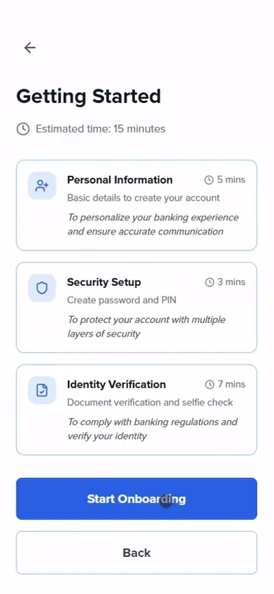
- 01Getting started
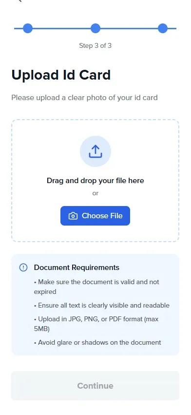
- 02Upload ID
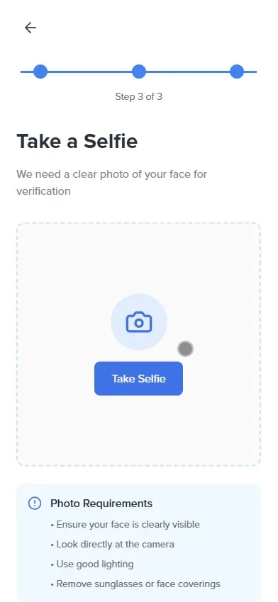
- 03Take a selfie
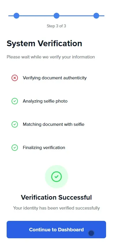
- 04Verified
- 05Account type
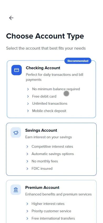
- 06First deposit
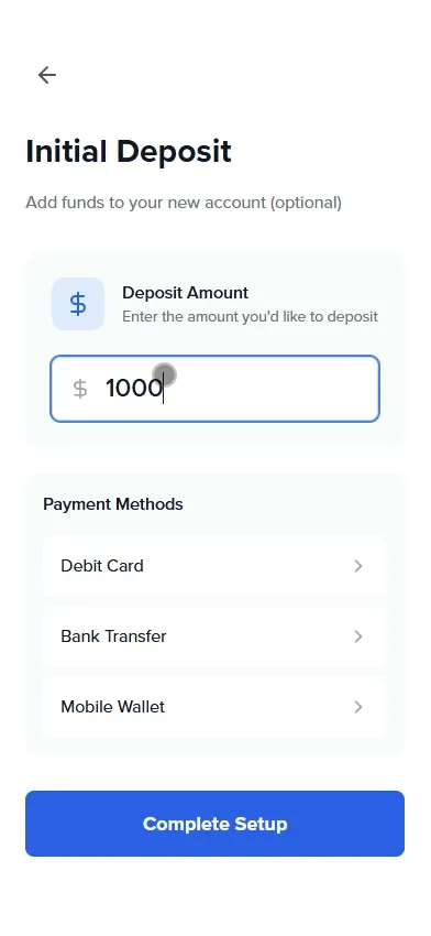
- 07Dashboard
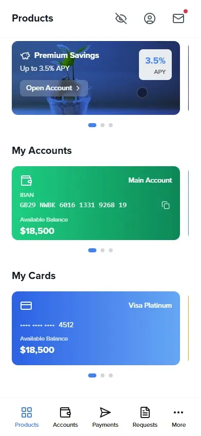
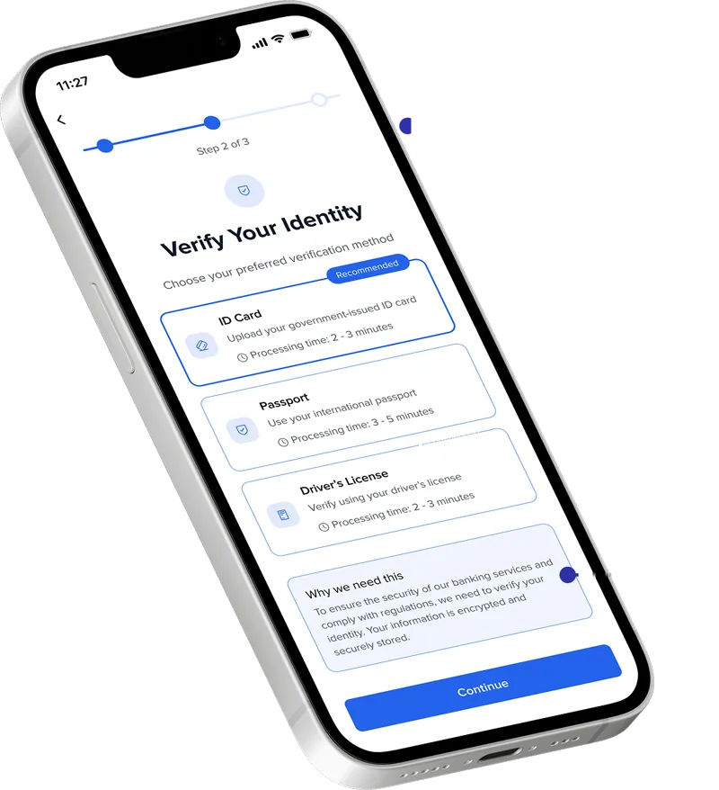
Verification people understand
Streamlined document scanning and selfie verification reduce cognitive load, with visual cues for better capture success.
- Clear progress indicators
A visible step tracker shows where you are and how much is left.
- Time for every method
Each verification method shows its processing time, so people can pick what fits them.
- Contextual guidance and microcopy
Friendly, human language explains why actions like ID scanning are needed.
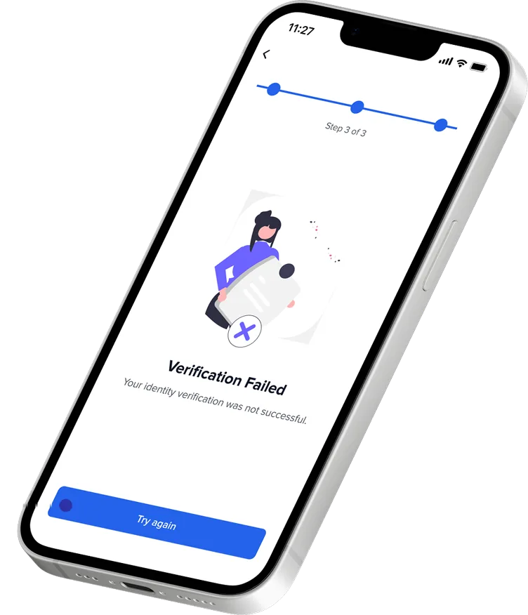
Errors that don't leave you stuck
This was the gap no competitor covered. The redesigned error states turn a dead end into a clear way forward.
- Still in the flow
The step tracker stays on screen, so a failed check doesn't feel like the end.
- Plain language
A short, human message says what happened, instead of a vague alert.
- A real next step
Actionable solutions like Try again or Contact support let people continue on their own.
Expected results
This is a concept, so these are the outcomes the design aims for, not measured numbers.
- ExpectedHigher completion rates
Less friction in every step.
- ExpectedMore trust
Transparency and guidance from the first tap.
- ExpectedFewer support calls
People solve most onboarding issues on their own.
- ExpectedA real difference
It addresses pain points other banks ignore.
- Try it yourself
Click through the whole onboarding in the hi-fi prototype.
Open the prototype ↗